Wednesday, 1 July 2015

Keep it under your hat


Once upon a time many national cultures were hat-wearing cultures. Everyone, or nearly everyone, wore them, and they wore them every day, not just for funerals and weddings. Kids wore them to school, or when out delivering newspapers; grownups wore them to work and to church, or just to go and fetch some groceries. For men and women a hat denoted a world of class, inflected by gender, ethnicity, age, region and eccentric preferences. Some jobs were signalled immediately by the choice of hat (butcher or bookie, for instance). But it was a dangerous thing simply to assume you knew where a person sat in the social hierarchy just because of the hat that they wore. And of course it wasn’t just the choice of hat that was important, it was also the way you wore it. When hat-wearing died out what was lost was a smorgasbord of micro-gestures: hat tilting, hat tipping, hat hanging, and a range of jaunty and not so jaunty angles. It is hard to imagine the Hollywood worlds of Film Noir without hats, or comedies like His Girl Friday as a hatless movie. Song and dance numbers needed hats the way that tap-dancing required special shoes.
            How did hat wearing die out? When did hat wearing begin to mark you out as an eccentric or as old-fashioned or as an extravert? Presumably it was gradual, the cultural work of a generation. Presumably a young generation of adult males (or mainly males) entering the workplace started to stop wearing hats as they sought to differentiate themselves from an older generation of hat wearers. Or perhaps casualization meant that it just began to become noticeable when young people were wearing hats as if they were trying to be old before their time. School teachers at more progressive schools probably started to jettison the school cap or hat as an affectation of more disciplinarian schools. Gradually hat wearing would seem old-fashioned. But as hat wearing stopped being a ubiquitous part of everyday life hat-based sayings simply carried on unperturbed. People still keep things under their hat even if they have no hat to keep things under; urban nomads might continue to say ‘wherever I lay my hat that’s my home’ even if they are dogmatically hatless.
            Many hats had a practical purpose of protecting the head from the cold and the wind, from rain and snow, or shadowing the eyes from strong sunlight. But there was also something of a lived metaphorics about hat wearing. To put a hat on your head when leaving home in the morning was like putting a roof on your head: it suggested the continuation of a domestic, private space that could continue within the public realm. Peaks and brims worked like awnings and vestibules to suggest a semi-private space. Today we negotiate the private dimensions of public space with earphones and smartphones. But hat culture was always much more permeable and nuanced. Sure you could pull your hat down as a ‘do not disturb sign’, but you could also tip it up a notch to suggest a friendly openness to communication.

Is there anything more intimate than the idea of two be-hatted people kissing?

Friday, 12 June 2015

All that is solid melts into air


Charles Saatchi’s first ‘public’ gallery was in London’s St John’s Wood and opened in the 1980s in an old paint factory, not too far away from Sigmund Freud’s final home. You couldn’t have hoped for a more telling symptom of the times. Here was the advertising guru who had helped Margaret Thatcher (with her espousal of a return to Victorian values) get into power, and here he was collecting and curating avant-garde art. It was like watching epochal change on fast-forward. The old factory that once manufactured paint for industrial and domestic use, produced for painting walls and ceilings, was now being repurposed so that visitors could look at paint in a very different form, and one that was way out of the price range of ninety-nice percent of the visitors.
            The first time that I visited the Saatchi Gallery was for a press opening that I had somehow managed to wangle an invite for (perhaps I intended to write something about the exhibition of American art that was on show). The floor and the walls had all been newly painted with heavy-duty white emulsion. I had been to white cube galleries before, but none that took it quite so literally and none that realised the de-materialising space so completely. At one point in the gallery there was a step between two levels of the gallery. It was almost impossible to see and you would watch journalists regularly tripping over it as they tried to balance canapés and notepads while negotiating this invisible obstacle. The step was a little touch of the real in a space that seemed to have lost all contact with the ground, or with any sense of place or reality.
            It must have been my second visit that I saw and experienced Richard Wilson’s installation 20: 50. The artwork is a room that you enter via a walkway that feels as if it is carved into a solid dark mirror made of oil that completely covers the rest of the room. Wilson’s installation must be the most perfectly realised site-specific artwork for the Saatchi experience: even though the gallery has changed premises a number of times, this work is perfectly suited to the Saatchi ethos. It offers both an immediate embodiment of the Saatchi world – a de-realised space of reflective surface made out of that number one commodity, oil – and an imminent critique of that very same world. This is an art work that un-grounds you while making you dirty. The reflective surface is so perfect, so unworldly, that people can’t help themselves they have to touch the mirroring material. And here is the second touch of the real. What looked sleek and impenetrable turns out to be used sump oil that immediately ruins clothes and saturates skin. There is a legal warning from the Saatchi Gallery that accompanies the exhibit. Should you dirty yourself then Saatchi is not legally responsible for your dry cleaning bill.


Thursday, 11 June 2015

Roadside Memorials


For a while I lived in the London ‘village’ of Barnes. It’s just over the river from Hammersmith and is favoured by media types and artists of a certain age (it has become far too expensive for the younger brand of bohemians). I had a very cheap room there as my friend ran the fish shop in the High Street. Sometimes in the morning I would find purple and blue lobsters lumbering around with thick elastic bands around their pincers. (I would see them again later, inert, and a livid orangey-pink.) In one of the residential streets I noticed a blue plaque telling me that Kurt Schwitters had once lived in the area.
            It was in Barnes that the pop star Marc Bolan had died. His Mini had crashed into a tree on the bend of a road. I can remember when he died. Or at least I think I did until I looked it up on the internet and found that he died in 1977, when I was 16. In my memory I was about ten or eleven and one of the teachers at school told us. I remember how he rushed into the classroom visibly upset and told us that Bolan was in hospital and it looked like he was going to die. This can’t have happened as I was at a different school in 1977.
Bolan was for me the iconic pop star of the 1970s. With satin trousers and tousled hair Bolan was the one and only electric warrior. Well perhaps not the only electric warrior: there was always Micky Finn to contend with – the mysterious bongo player who cast an eerie shadow over T-Rex. What was he doing? Who needed a bongo player when you had a drummer? Perhaps he was there for the parties, the glamour; perhaps he was Bolan’s minder or his dealer?
            When I was in Barnes I visited the site of Bolan’s crash. I knew it was a site of pilgrimage for his fans and that a shrine had built up over the years, with keepsakes, letters and ribbons festooning the very tree that had killed him. Like lots of things in life it was a good deal grubbier than I had imagined it. The purple ribbons had frayed and turned the colour of wet concrete. The letters had become unreadable after the predictably unpredictable English weather had had its way with them. I wasn’t sure what looked worse: the thoroughly dead flowers or the plastic ones whose unnaturally bright colour was fading as it absorbed the colour of exhaust fumes.
Where I live now I always pass a roadside memorial on my way to the train station. It must have been there for about ten years. The flowers and cards are replenished once or perhaps twice a year (on the anniversary of the crash, and perhaps the birthday of the deceased, would be my guess). It is formed around the metal post of a road sign. There is little that is more dispiriting that the sight of dead flowers stained with car fumes. The flowers and cards are taped to the post with parcel tape. This year there is a new addition. At the bottom someone had taped (using the same tape) an open can of cider. Perhaps it was the favourite tipple of the person being memorialised. Perhaps a drunk driver had caused the crash and this was a way of marking that fact clear. It reminded me of a wreath that had been fashioned to look like a giant cigarette (it is included in Jeremy Deller’s Folk Archive). The wreath memorialised the deceased’s deep love of cigarettes, a love that for some is also a death sentence.


Sunday, 7 June 2015

Coloured Mud


In some distant time, when the treasured items of industrial modernity will have been disinterred from the ruins of the Anthropocene, there will be some questions about what to make of those rectangles of paint on canvas to be found in museums across the world. What could be said, for instance, about those rectangles where the paint is arranged in patterns of line and areas of colour that don’t seem to refer to anything out there in the world (or out there in a world that once existed)? How would an archaeologist specialising in earth-history square the idea that these highly worked surfaces were produced at the same time as the world was producing global communication systems, pursuing space investigation, and developing human organ transplants? Would they be seen as cultic residues from a previous age – some weird, untimely practice with mystical associations? And how would this fit with the incredible monetary value that had been attached to some of these rectangles, or the critical evaluations that had declared these works as ‘cutting edge’, ‘progressive’, and so on?
            Perhaps the producers of these paintings will be seen as mystics, shamans, weavers of magic spells? Or, more reasonably, as people who spent their lives experimenting with colours, space, tone, light and line, as a way of investigating nature, of cultivating an attention towards the perceptual world. From the other side of the Anthropocene such practices will be greeted with some sympathy if they can be understood as attempts to investigate nature but without the added ambition of then being able to exploit it for financial gain. The impetus to investigate colour, for instance, might well be seen as close to the metallurgists working to produce new alloys, but without the same potential impact on the earth. These coloured rectangles would perhaps be seen as non-instrumental experiments that refuse the ambition of wanting to master nature.
            Yet the world of instrumental reason is vindictive. As a planetary force it is spiteful. Here it casts a veil of ludicrous inflated financial worth over these sensorial experiments. To stop us seeing them, it renders them opaque by equating them with the bombastic lustre of the commodity form. It is hard to see a painting of squiggles and blotches when it comes with a price tag in the tens of millions of dollars; it is hard to see it as a project to engage with when it is locked up in the massive jewellery stores that go by the name of National Galleries. An alternative reality would have liberated them, sent them out to grace the walls of primary schools, hospitals, and community centres. In this reality painting abstract paintings would have been seen as a noble pursuit: like keeping an allotment or learning the ukulele or designing a school. 

Saturday, 28 March 2015

First Party


I’m sure I had been to parties before – kids’ parties, with games and jelly and ice cream – that sort of thing. But this was the first party I can actually remember, and the reason I remember it so clearly was because it was a kids’ party which was pretending not to be one. I’m not sure what, exactly, it was trying to be: perhaps something like a child’s idea of how a bunch of fifteen year olds or sixteen year olds might party? Or perhaps, more precisely, a twelve year old’s idea of how a sixteen year old who was imagining a twenty-four year old partying, might party. I was nine at the time, and one of the younger ones. The year was 1970 and on the turn-table that night were the current picks of the pops – Bobby Bloom’s Montego Bay and Three Dog Night’s Mamma Told Me (Not to Come) – these at any rate were the songs I can remember.
I can’t imagine that there were many people at the party: ten, fifteen at the most. It was at a friend’s house and their parents were out. The party was just the neighbourhood children: brothers and sisters between the ages of about eight and twelve. We were tooled-up to party with our treasured collection of seven inch singles, with bottles of cherryade and R Whites lemonade, and with oodles of crisps. The record player was a hulking great teak cabinet with valves. You could stack five or six records at a time, though the more you stacked the looser the traction was: you often ended up with your final single sounding as if it was being dragged, wobbling, down in pitch by half an octave.
What I remember most was the lighting. It felt like a very different kind of party because the lights were turned down so low. Low lighting in an era where bright electrical lighting was easily achieved felt ludicrously debauched. If you didn’t have a dimmer switch you turned off the main light and obscured the brightness from a side light. If you were particularly groovy you might have a coloured lightbulb (red or blue) for the ambient light. Total darkness was always a possibility, but given the amount of crisps and the staining potential of the cherryade who would want to risk it? We did of course.
The Montego Bay single was a great favourite and had one of those sing-a-long choruses which didn’t entail having to learn any actual words just oohs (like the much loved Na Na Hey Hey Goodbye by Steam, and later covered by Bananarama). But it was the Three Dog Night song (which was a cover of a song penned by Randy Newman) that set the aspirational bar for that night and for any party since. Mamma Told Me (Not to Come) was like an obscure lesson in partying the bohemian way. It gave you no clear information about how to achieve the requisite level of partying, but gave you an exceptionally clear indication of what the desired outcome was: ‘This is the craziest party / That could ever be / Don't turn on the lights / 'Cause I don't wanna see’. What sort of a party could this be? So wild that it would terrify you to behold what was going on?
We were young and I have no recollection of seeing anyone snogging or even close dancing. But it was dark. I can imagine the terror for any adult who turned the lights on: children dancing by grinding potato crisps into the shag-pile. Oh the horror.


Monday, 23 March 2015

Stamps


Like many children in the 1960s, I collected stamps. It was a relatively cheap hobby and there was always the possibility that one day your collection could be a treasure trove of rare gems. I still have my album and it is filled with Hungarian stamps (Magyar Posta) commemorating the 1960 Olympic games in Rome, butterflies, and Jurij Gagarin’s space flight; Polish stamps (Polska) commemorating the 1964 Tokyo games, the Grenoble winter games of 1968, and gliders; and Czechoslovakian stamps (Československo) commemorating Gagarin, flowers and birds. I guess I bought the stamps as pick-and-mix bags from the local newsagent. I can’t imagine that the good people of the village where I lived were in regular correspondence with their comrades behind the iron curtain and were passing their exotic stamps on to me.
During my brief term as a miniature philatelist there was one suite of stamps I particularly liked. This was the British Post Office’s 1971 collection of ‘Modern University Buildings’, featuring buildings from the universities of Southampton, Essex, Leicester and Aberystwyth. To my mind they have the same register and tone as the stamps from Hungary, Poland and Czechoslovakia – they welcome the future with open arms. And, little known to me at the time, it was my future they were welcoming: I spent too many chaotic nights as a teenager in the student union at Essex University ‘partying’ to Iggy Pop, Roy Harper, the Psychedelic Furs (and so on) – not as a university student (I was at the local FE College).
There is something perfect about a stamp: it is a form of money, yet it has only one particular task to perform – the task of transport. For a while the post office used to sell large-scale versions of their stamps as postcards. The postcards even had crinkle cut edges like the real thing. I wished that these postcards didn’t also require an additional stamp for postage, but they did. It never seemed to be possible that you could send the stamp postcard with an identical postage stamp on the back.  

Sunday, 22 March 2015

Everything Must Go


When the headache-coloured skies of winter descend, the ubiquitous advertising hoardings and illuminated shop fronts take on a new role. Giant backlit transparencies, neon signage or electronic screens punch holes in the drab, proximate environment. Amidst the sleety drizzle and along the wind-whipped pavements, you find sun-blushed, luminous visions that mock the dull muddy greys that fashion the neighbourhood. Through the general hangover darkness of mid-afternoon, you glimpse the gleaming Mediterranean blues of Davidoff Water (and Davidoff eyes); through the dank curtain of another overcast Wednesday you catch sight of Colgate’s smile, Nivea’s pout, and L’Oréal’s self-satisfied grin.
In the 1980s I was taught that this world of advertising needed decoding. Advertising was a text that smuggled in ideologies of a certain kind of life while flogging you unnecessary luxuries. But in many respects the dream-world of advertising is an easy one to interpret: buy this and become attractive; make people envy you by having a fitted-kitchen made out of floating minimalism. And it is easy to recognise that the world fashioned from advertising is made out of impossible bodies, improbably at ease with themselves and each other, living in environments untouched by the worldly forces of decay, disease, poverty, or even something as ordinary as rough, lined, mottled skin. All you have to do, after all, is to look out of the window of the bus and compare the ad-world and the ad-people with you and your fellow passengers. Perhaps rather than decode advertising we just need to see the scale of it. How could you do this? Perhaps some multi-billionaire will buy all the advertising space of a entire city, and all the advertising slots on broadcast media, all the algorithmic adverts on the internet and replace them all with one image: of fire, burning, consuming, crackling...
Rather than interpreting adverts I think I want to return to Raymond William’s 1960s notion of advertising as a magic system, conjuring illusions through misdirection and sleight-of-hand. To get some grip on advertising requires less attention to its manifest and latent contents, and more attention to its phenomenal forms: the way it chases you down as you waft across the internet; the way its impossible images belittle real affection; the way its grammars of value inveigles ordinary talk. It’s a bonanza and everything must go. 

Saturday, 14 March 2015

Scenography of Dreams


Freud, in his big book of dreams, claims that the grammar of dreams is a negotiation of the past and the future pressed through the preoccupations and happenstance of the present. A dream, for Freud, roughly follows patterns inherited from the past, driven by a wish for the future (that the dream might fulfil in some way), thrown together with what Freud calls the day’s residues (the remains of the day). You can see the truth of some of this when you work out that this or that bit of your dream is borrowed from last night’s barely registered television watching.
            More and more I think of the patterns of the past taking the form of distinctive cartographies. Over and over I’m locked into an oneiric commute, or else I’m having to deal with situations within a particular house. The trouble with these commutes and with the dream houses I occupy is that are determinedly impossible and unmanageable (or rather they follow their own dream logic). One of my dream commutes has me having to catch a bus ‘home’. I’m late of course and the last bus will be leaving soon. I know where the bus stop is, and all I have to do is go to that bit of town and catch the bus. The only trouble is that the dream confuses me as to where I am. I know the part of town precisely: it is a street that starts wide and gets narrower as it moves away from the centre of town; it has some shops (for instance a large furniture shop that is sometimes a musical instrument shop or a sweet shop), and the street gives way to more and more domestic houses, some very old, as the street narrows. It is not a salubrious part of town: perhaps students live here; perhaps some of the houses are used by small-time lawyers and insurance companies. I need to go either east or west but my sense of direction and my sense of the route I need to take is based on a quite different urban landscape. It’s as if I’m trying to find my way around Berlin using a map of Paris (an old Situationist ploy): or to get more of a sense of the regional scale of these dreams – it’s as if I’m trying to find my way around Colchester in Essex with a map of some other small regional town.
            The houses that I inhabit in dreams all seem very familiar. Perhaps an amalgam of houses that I lived in my twenties when I moved house a couple of times a year. The houses have too many rooms and there is always a room that throws the logic of the house out of joint: for instance a small terraced house might have a small container ship as part of the basement. The container ship might be small (for a container ship) but it is gargantuan compared to the scale of the house. [I get excited thinking that one of the containers would make a good studio.]
            My dreams are made up of the edges of things: the edges of town; the corridors between rooms; the patch of packed earth near a small copse on the edge of a playground. Whatever there is at the centre is of no concern of mine.

Wednesday, 11 February 2015

The Going


I’m not alone, I wouldn’t imagine, in being drawn to the technical vocabularies of others. I’m especially drawn to words and phrases that are part of ordinary language (rather than the Greek-Latin nomenclature of medicine or horticulture), especially when those phrases seem to bring a ritualistic element with them. ‘Topping Out’ and ‘Breaking Ground’ conjure up, for me, magical achievements, the slaying of fearsome beasts. I’ve watched too many Grand Designs on TV, perhaps. Even phrases like ‘second fix’ suggest tasks of great magnitude. I think that the fascination with such a language comes from an unformed daydream of being someone who uses such terms, habitually. It is the same with the Shipping Forecast: what would it be like to have a close knowledge of ‘squally showers in Fitzroy, Lundy, Fastnet’, to have an immediate grasp of a phrase like ‘occasionally moderate later’?
            Recently I learnt a new word – the going. It names the ‘throw’ of a ladder, the distance on the ground between where you place the base of the ladder and the base of the vertical wall that you are leaning it against. It names the length of a step in a staircase. It is a perfect word, and one filled with existential overtones. It seems to describe a world with an indifference to plummeting depths and vertiginous heights. What matters is the going: the forward motion that would take place even if you had to retrace your steps. There is no going back, there is just going. The going. It seems to tie time to movement as an inexorable law: now and until you leave this world you will be going. It sets us all on a horizontal plane of time and movement, where all we can do is go on. Until that is we don’t. And it, turns out, that not going on is also the going, the ultimate going.
            ‘The Going’ was the name of the first poem that Thomas Hardy wrote after the death of his wife Emma. They had been estranged for some time and it seems that Thomas Hardy had made Emma Hardy’s life fairly miserable in her final years. He hadn’t seemed to notice how ill she had become. In the poem Hardy describes his wife’s death as ‘your great going’ and ‘your vanishing’. The keep on keeping on is the going, but so too is the stopping. In both its technical sense as a measurement of horizontal distance for technologies that traverse heights (ladders and stairs) and its vernacular sense of the moving along, of leaving, it seems to describe the great incessant onwardness of life. We like to know that we are going-on but not necessarily where we are heading in our ultimate going.


Wednesday, 4 February 2015

Lines of Desire


For a while, some years ago, I used to like to photograph the informal tracks that were made across common ground. These tracks marked the ground with diagrams of trajectories taken, of veerings veered and short cuts cut. Repeated footfall had rubbed the grass bare and indented the earth below. The areas that I was most drawn to were the anonymous scrubs of land that people used for walking dogs, or were used as a quick back route between houses and bus-stop, or were used by kids to conduct their non-digital encounters (to drink non-digital booze and smoke non-digital joints). These tended to be untended landscapes. What the surrealists used to call terrain vague – vacant lots, no-man’s land, a landscape of the vague. Because such places were untended these improvised tracks used to ‘take’ better there than they would if they had been in front of a cathedral or in a well-kept park. But even in such over-tended places tracks of bare earth appear, cutting lines through neatly trimmed lawns.
The sculptor Carl Andre (famous to most Britons over the age of 40 as the artist behind the ‘bricks’) was once given a commission by a museum to make a public sculptor. He decided to produce a sculpted path that people could use to use to walk across a new patch of parkland in front of the museum. But he decided that he wouldn’t impose his own route; he would let common usage choose it for him. So he had the patch of land seeded and waited for the grass to grow. Then the grass was cut and the patch of land became just another part of the museum’s grounds. And Andre waited. And sure enough a track began to emerge of people who cut across the grass instead of following the official walkways around the lawn. So Andre used this track and placed his path there. It was a collective effort. Some months later other lines began to appear that veered away from Andre’s path. These were new short cuts, slightly longer than the short cut that Andre had used.
People don’t stick to the path. And why should they? I learnt recently that urban planners and their ilk call these improvised and collective paths ‘lines of desire’. As if collective desire had found its expression in these desultory pathways, as if our desire for more satisfying lives had found its satisfaction in marking-out a trajectory of barren earth. 

Saturday, 15 November 2014

Bucolic

Bucolic is a word that to my ear always sounds as though it should be used to describe people who are far from well: ‘we were expecting it, just before he died he had a bucolic look about him’, ‘blimey, you don’t half look bucolic’, etc. Of course it means quite the opposite and points to a world of countryside fecundity and pastoral idylls. My misapprehension of bucolic as describing ill-health is partly due, I would guess, to its phonic similarity to the word bubonic. Close in sound, distant in meaning. But perhaps the phonic similarity does suggest some instability in our truck with the countryside or at least how that countryside is often experienced.
My very first, and very vague, memory of wild nature (at the age of about 2 or 3) is a hollow tree that stood on the edge of a wood near where we lived. Perhaps I don’t really remember it so much as remember being told that this was a tree my sister and I loved. We called it the Owly tree, for reasons I can’t fully remember (perhaps an association with Owl in the Winnie-the-pooh stories). Many years later I visited this tree to see if it brought with it a wash of involuntary memories. Instead I was confronted by a small stumpy tree which looked rotten. It was also by the side of a fairly busy road and had the distinct tarnish of a petroleum-exhaust glaze. [In the mid-1980s I was living in Barnes in London and went to visit the tree that Marc Bolan crashed into when he died. It had become a shrine kept going by his many devoted fans who placed purple ribbons and sorrowful sentiments all over the trunk of the tree. All the ribbons and cards looked filthy with dirt and pollution.]
            For many people growing up in some form of peri-urbanism, this is the sort of commerce we have with the countryside. When as a child I could go out-and-about by myself, my friends and I used to go to a place that we called the Volcano. It was a sloping patch of bare earth in a scrub of woodland. It was magical to us and became our den. We thought of it as extensive, untamed, remote. In reality it existed as a strip of woodland between a main road and a housing development. Like a lot of such places there were signs of peripatetic existence: a fire, some empty cans, a newspaper, the odd piece of clothing. Such signs of occupancy conjured-up the romance of a vagabond life, but they also looked like the scene of a peculiarly nasty crime.
            The artist Stephen Willats gets something of this instability in a series of photographs he produced in 1978 for his book The Lurky Place. Willats offers us views of scrubland and unfarmed fields that could plausibly fit an idea of the picturesque. Yet these are landscape littered with signs of a life: a used paper target; the wheel from a pram. To describe this life as bucolic would be wrong unless the describer was caught in the misapprehension that the word could describe a rural world that was closer to fetid than fecund.   


Friday, 14 November 2014

Deplanning


Looking around our urban environments what is most evident is the hand of the planner. We see road systems and streets, office blocks and parks, roundabouts and street furniture. We are directed by planners, and negotiate our way through their diverse and labyrinthine work. For anyone who has lived in the same city for a while what is most noticeable is the latest planning development: the new shopping complex; a new pedestrian area; a new road. Older projects are part of our habitual world: they are what we have come to expect. Some of these older projects are clearly hanging around waiting for re-development. The sort of concrete passageways that pass under large roads are no longer considered desirable. In the late 1960s and 70s the increase in urban traffic, and the inherent problems that this created (air pollution, danger to pedestrians, snarl-ups on inadequate roads, etc.) was met with an idea of creating different levels for pedestrians and traffic. Planners imagined pedestrian-only piazzas and shopping areas, while cars zipped across the city on some other level. Usually the cars were raised above the pedestrians and shops, who were dropped into excavated sites in what turned out to be dank and unlovely walkways. For these concrete underpasses the days are clearly numbered.
But what is less visible in our towns and cities are those projects that never quite happened. In 1972-3 Bristol city council acquisitioned a large area of land close to where I live. They tore down about 500 houses and a significant number of shops to make way for what would be an outer orbital road. The road was never built. The residents of the area, who were often chronically poor, put up a valiant fight against the planners. They lost. What was left were vast tracts of nothingness, and a memory of an area once filled with shops that connected the enclaves of Totterdown and Knowle to the centre of Bristol. The demolition produced discontinuity, gaps, and a sudden jolt in the environment as you moved from the centre to what was now clearly marked-out as the periphery.
Cities are discontinuous. The process of uneven development marks out an area as on the rise or falling: one neighbourhood is high-bourgeois in one century and ghetto in the next. The planner’s job is unenviable: they are caught between ameliorating the effects of uneven-development and facilitating those forces that produce it. No wonder that planning is never simply about bringing plans to fruition. It is also about losing your nerve and giving up on one plan as you embrace another. Priorities change, personnel change. And we live with other people’s dreams and nightmares. We live a peculiar form of the future perfect where that future never came to be. It is the world articulated in the title track of Laurie Anderson’s wonderful 1982 album Big Science:

Hey Pal! How do I get to town from here?
And he said: Well just take a right where
they're going to build that new shopping mall,
go straight past where they're going to put in the freeway,
take a left at what's going to be the new sports center,
and keep going until you hit the place where
they're thinking of building that drive-in bank.
You can't miss it. And I said: This must be the place.


Wednesday, 12 November 2014

For your listening pleasure…


            Yesterday, on the train to Brighton, I found myself sitting next to a business man. Everything about him screamed ‘Business’; from his pink striped shirt, to what was left of the grey hair on his balding head (he must have only been a few years older than me, but to my deluded eyes he was from another generation). Just in case it wasn’t quite clear how deeply connected he was to the world of high-finance, his IBM ‘think pad’ laptop was attached to an Ernst and Young lanyard. Ernst and Young are a huge global financial organization that undertake financial audits, tax services and all kinds of financial advising: I was clearly in the presence of a money drone. Because I’m nosey and can’t help myself from trying to read lines of text or titles of books, I had a sneaky peak at the flow charts on his lap top, but I couldn’t make head nor tail of them. But after about an hour I did notice what he was listening to on his mp3 player: Cabaret Voltaire’s Nag, Nag, Nag from the late 1970s. Cabaret Voltaire are, or at least were, purveyors of loud, throbbing industrial noise music, often accompanied by experimental films when they played live. They were the sort of pre-post-punk band that made nearly all-other punk bands and post-punk bands seem a bit on the cute side.
            I had a vision. Perhaps all the CEOs of large companies, all the managers of Hedge Funds, all the directors of Merchant Banks were still deeply attached to the music of their late teens. I imagined mahogany panelled offices with extensive views of the Thames being inhabited by suited business men with headphones blasting out classic Fall anthems (‘the West German government sent over big yellow trains to the Teesside docks… the North Will Rise Again!’). Perhaps there were boardrooms stuffed with people undertaking acquisitions and mergers whose playlist were brimming with the caustic sentiments and sonic blasts of the Pop Group, Pere Ubu, the Au Pairs, and Blurt.
A little while later my fellow commuter changed his mp3 player to the proto-rap of Gil Scott Heron. The revolution will not be televised. Indeed.
Was this a contradiction? Were these the fifth columnists working in the market place? Were all these money drones really working to bring about the demise of capitalism (in which case they were doing a pretty impressive job)? Or was it something else; a form of mourning?
Some years ago they built a large supermarket in an area of my town that once had a large open market next to a dog track. At one point it was a thriving area. The supermarket and the other large box stores that accompanied it put paid to that. Inside the large supermarket were wall-size photo-murals depicting in sepia tones the bygone age of open-air markets. There is was no irony here, or contradiction. Just dislocation and discontinuity. This will kill that. This has killed that. Nag, Nag, Nag is the torturous cry of a de-industrialising age. It is ghost music.   

Monday, 20 October 2014

Metal Fatigue


The sociologist Bruno Latour once wrote that ‘no human is as relentlessly moral as a machine’. By this I think he meant that no human has the sort of immediate, automatic, and unflinching certainty that machines manifest. You know where you are with machines and tools: they do what they say they’re going to do; they open cans, bang in nails, vacuum clean your house. If they let you down – and they do – it is because of some systemic failure; they don’t let you down by being insincere, by going behind your back, by lying about you or by handing you over to the State Police on the strength of a bribe. When they let you down it isn’t an issue of morality.
            Basil Fawlty (from the 1970s comedy drama Fawlty Towers) functions, for the most part, at a pitch of seething fury. The narrative arc of each show moves from a state of potential joy (Basil hopes to make some money on the horses; he has a new upmarket menu; and so on) to seeing his hopes dashed on the rocks of his own overreaching social ambition, snobbery and ill-humor. In perhaps the most famous scene from the show he canes his car (that he has failed to get fixed) for being willfully disobedient, for conspiring to ruin his plans. It is a scene of anthropomorphism aimed at the inorganic (“right, you’ve asked for it” he screams when the car yet again won’t start), and it claims intentionality and consciousness for the supremely indifferent car.
            Basil Fawlty behaves irrationally: who could possibly believe that the car had it in for him? Much better, no doubt, to think that the inorganic world of tools and circuits will work just as long as they are able to, and that when a piston fails, when rubber perishes, when a connection disconnects, that this is due to the laws of entropy rather than a malevolence that has found its way into the world of things. Yet when the handlebars of a bicycle snap in two when you are hurtling downhill, or when a chair disintegrates after you’ve been sitting on it for twenty minutes, or when your computer simply won’t follow commands it has been following for several years, who can remain rational?   
Two weeks ago I bought a small kitchen knife. It is fiercely sharp. I think it could split molecules if not atoms. The first time I used it I was cutting up some lettuce (totally the wrong knife for the job) and sliced through the side of my thumb. I knew that the knife hadn’t meant to wound me: it wasn’t a vindictive knife or an angry knife, or a psychotic knife. I only had myself to blame. Yet I can’t bear to look at that knife now. I can’t forgive it and I have tucked it away at the very back of the knife drawer where it will languish unused forever. So there.

Monday, 8 September 2014

Seen From Above


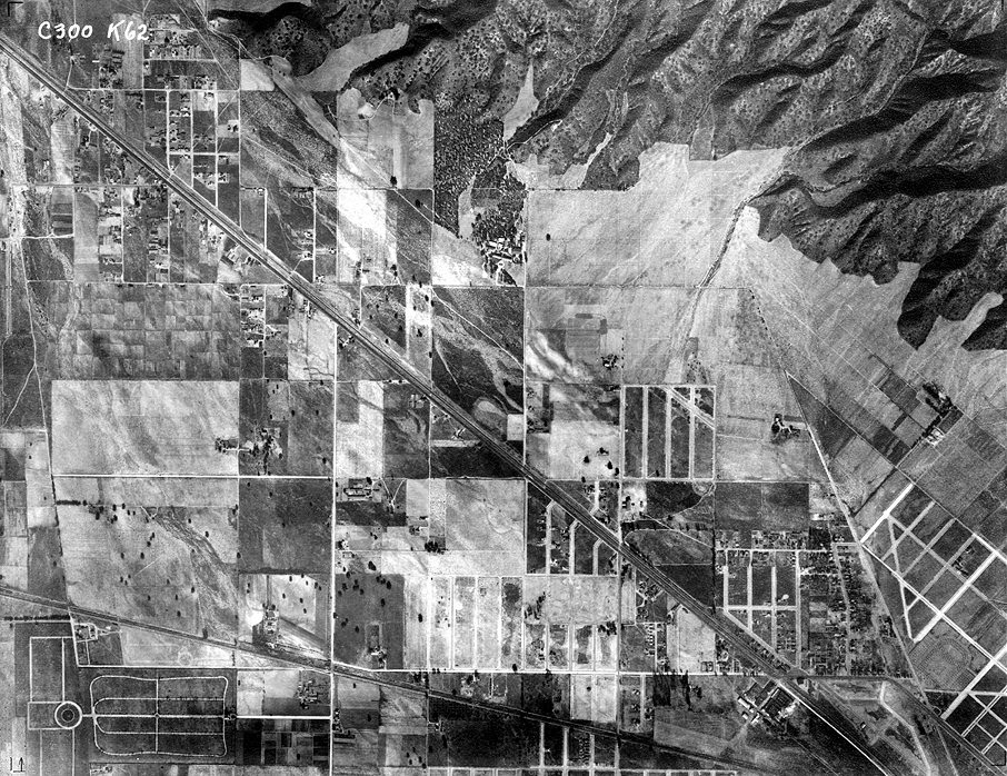
In 1980 the French intellectual Michel de Certeau wrote about what it was like to look down on the streets of Manhattan from the 110th floor of the World Trade Center. De Certeau died before those towers took on the meanings that they have had since 9/11, 2001. But his point wasn't about those towers in particular. He thought that the “pleasure” of looking down on the world from a great height was due to the way that it freed you from the pulsating and ultimately unknowable hubbub taking place at ground level. The view from above was the God-like perspective which rendered the world readable at the cost of our separation from it. Cartographers, city planners, bureaucrats, and administrators viewed the world in this way because it abstracted populations and landmasses so as to render them knowable, manageable, and malleable.
There is pleasure in aerial photography and it’s hard not to see this as connected to its power to abstract. Aerial photographs have a special kind of beauty because they both register the world and offer us a view of that world that most of the time is unavailable to us. We find it hard to connect the photographs to a world that we know: much easier to enjoy the patchwork, the shapes, the lines cut by rivers or roads. That this perspective has been associated with death, with killing is of course unavoidable. The Orson Wells character in The Third Man justifies his racketeering in dodgy pharmaceuticals with the view from the top of a Ferris-Wheel in Vienna.Look down there” he says “Would you really feel any pity if one of those dots stopped moving for ever? If I said you can have twenty thousand pounds for every dot that stops, would you really, old man, tell me to keep my money - or would you calculate how many dots you could afford to spare?”
In a book of aerial photography that was published in 1953 (Our World from the Air: An International Survey of Man and his Environment) a foreword claims that the twentieth century is the century of the air in the same way that the 19th century was the century of the railway. Because the echo of the Second World War was still reverberating loudly it at once recognises that mechanical flight had allowed humans to drop thousands and thousands of bombs on each other, but wanted to push the reader into thinking about how aerial photography could be used by “the geologist, the archaeologist, the town-planner, the sociologist”.
Today when so many more people have had the experience of mechanical flight, aerial photography still offers an uncanny vision of the world. The view of the world you get from your budget airline passenger seat is never really vertical (unless something has seriously gone wrong) and is always mediated by the slightly cloudy double-glazing of the tiny windows. Aerial photographs have a calmness that is never available in the cramped seating of economy class.
They seems to speak more readily of some of the experiences of the young flyers who became pilots during the Second World War:

The physically amazing thing about flying, after the speed impression of taking off and low flying, is that as you gain height the sense of motion drops away. It’s nothing like looking out of the railway carriage and seeing the blurry silver worms zipping past or the ritual nodding of telegraph lines. It is impressively stable and still up there and this is the important point, the world is laid out for you in unfamiliar terms… the visual field is flattened more after the plan view of the microscope section than the elevation that everyday seeing is accustomed to.

This is the artist Nigel Henderson remembering his experience of flying. It was an experience that went from enormous pleasure to nerve-wracking fear. However familiar it may become, and however it is used for instrumental ends, the view from above is also always vertiginous and discombobulating. A god-like view is the view of someone who has no place. The view from above is also the view of someone falling to earth.

Thursday, 4 September 2014

Apocalyptic Wallpaper


In North America in 1952 the critic Harold Rosenberg coined a phrase – ‘Action painters’. Action painters referred to those who today are more usually termed abstract expressionists: Jackson Pollock, Lee Krasner, Mark Rothko, and so on. Rosenberg wanted us to recognise these artists as performing an existential act in the studio. He had some words of warning too. He warned that abstract artists could end up producing nothing more than ‘apocalyptic wallpaper’ if they weren’t careful. The fear of wallpaper and domestic design is everywhere in American abstraction at this time. Mark Rothko, for instance, somewhat earlier, reckoned his paintings ‘must insult anyone who is spiritually attuned to interior decoration; pictures for the home; pictures for over the mantel’. Likewise the critic Clement Greenberg was constantly wringing his hands at the way that certain artists could descend into the decorative as if it were a bad case of the ‘dreaded lurgy’.
Across the Atlantic there didn’t seem to be such a fear of the decorative, nor of the domestic. For instance in 1955 the sculptor and collagist Eduardo Paolozzi with his friends Nigel and Judith Henderson set themselves up as a firm to produce wallpaper, textiles, furniture and so on. The firm was called Hammer Prints Ltd. Paolozzi was at the time having a huge success with his sculpture. I like to think that British artists like Paolozzi (and by British I mean Scottish-Italian-British) had read Harold Rosenberg’s essay on action painting, and instead of heeding the warning about apocalyptic wallpaper decided that that was precisely what they wanted to do. What, after all, would it be like to live in house papered with apocalyptic wallpaper?
One of my favourite set of paintings is by the wonderful artist Susan Hiller. I saw an exhibition of her work at the ICA in London in the late 1980s. One of the exhibits was a series of works of paint on the wallpaper used to paper children’s bedrooms: wallpaper featuring parachute jumpers floating through the sky, or action heroes, or cute aliens. These were the gendered wallpapers of a different sort of action: masters of the universe saving the world – not so much existential actors as testosterone-fuelled maniacs. The paint obliterated most of the figuration, but allowed snippets to poke through. The painting used scaled-up images of Hiller’s automatic writing. In some of the paintings it looked like the male action figures were drowning in an unconscious patterning of paint.
For a while I was an abstract painter. My dad used to say that my paintings would look really good in the corridors and boardrooms of a large corporation. I think he was imagining the money that might come my way if I could snag such a commission, but he was also keying into the way that the corridors of power for a while at least, loved the sort of tasteful abstraction that looked simultaneously expensive and inoffensive. I think he also couldn't imagine anyone in their right mind buying one my paintings for their home. 


Wednesday, 3 September 2014

Foreign Holidays


When I was about eleven my parents took my sister and I on a driving holiday on ‘the continent’ (as we called mainland Europe). Over two weeks we dashed from one picturesque town to another across France, Germany, Luxembourg, Switzerland and Italy staying in an uneven range of small hotels. We were ill-equipped for such travel in the early 1970s because no one apart from my sister could speak another language, and she was always too shy or too stubborn to lend a linguistic hand. On one occasion, in a small German town, my dad dropped us off at a restaurant, parked the car and came to find us. He had made a note of the name of the street and so after the meal we went to look for the car in Einbahnstrasse. We found what we thought was the street but there was no car there. It was only by luck that we chanced upon the car in another street, and eventually understood that Einbahnstrasse didn't name the street just its condition of one-way-ness.
It was a holiday that was organised by a travel agent; a sort of package-holiday for people who don’t know how to relax (or are a bit suspicious of such hedonism). So we would keep bumping into the same fraught British families as we raced from one destination to the next. It was an era before air-conditioned cars where the seats were nearly always plastic, and where parking a car in a non-shady spot would result in the interior taking on an almost molten state (car rugs were needed to protect bare flesh from being fused to the fiercely hot seats). It was a holiday punctuated with travel-sickness, sullen silences (we took turns and picked up the slack left my dad’s endless optimism), and new experiences. Continental food, even in tourist-ready hotels, could prove tricky and my sister, who had been warned-off eating anything at all by a barmy xenophobic school teacher, maintained a strict ascetic diet of bread and fizzy drinks. And the fizzy drinks were a highlight – who knew that fizzy drinks could taste of apple, or that fizzy orange didn't have to have a radioactive colour and a flavour that made pure sugar taste bitter?
These days the frisson of difference doesn't seem so extreme. I notice it most in the small details. The pylons and telegraph poles are different. The grass is thicker, coarser, more springy. The street signs are placed differently. There are less road markings. The advertising hoardings seem to articulate different causes for commodity-based happiness. 

Wednesday, 27 August 2014

Sensibility Primer


In 1983 the architect Alison Smithson published a book called AS in DS: An Eye on the Road. It was a project she had been very loosely working on since the late 1950s when she and Peter Smithson traded in their Volkswagen Beetle for a Citroën DS (the books title refers to Alison in the Citroën AS in DS). The book (which is still available) is shaped to look like a Citroën DS seen from above and is called a ‘sensibility primer’. The inspiration for the book came about when Alison experienced the interior space of the Citroën as completely different from their VW Beetle: ‘I remember thinking you were so close together in the Volks and so far apart in the DS your relationship as a married couple was bound to subtly change. Now you could stand off the situation of each other. Then it was love in a box.’ Design, it would seem, has effects and affects and could alter the way you related to others, the way you loved.
            AS in DS is a phenomenology of a vehicle. It has diagrams of the car’s design, maps of the journeys that the Smithsons took, photographs and sketches of the views that she saw when travelling through various landscapes and roadscapes, and a continual diary of car experience. It is about sensibility. It is about the way perceptions and feelings alter when you are placed in a specific set of relationships to those around you and to your environment. It represents an alternative to a sociology of design that would look to see what sort of aspirations could be associated with driving a DS, what such a car symbolised. It is also an alternative to the aesthetic and practical discussion of what constitutes ‘good design’. It deserves to be much better known as an initial sally in the phenomenology of design culture.
We've just given up on our beloved Fiat Multipla (it was falling apart) and bought a second hand Volkswagen Turan. The Multipla is unusual because it has three separate seats in the front and the back (the one we had also had the distinctive forehead bulge between the windshield and the bonnet). With three seats you could have the middle one down which immediately allowed for more communication between those in the front and those in the back, or you could sit three across in the front. I think I only realised how brilliant this was when we gave it up. A car with two seats in the front seems to insist on that fundamental arrangement of cars: the front reserved for Mum and Dad, or Dad and Dad, or Mum and Mum, and the back seat the ‘ghetto’ for the kids. These generational zones (serious up front, bickering in the back; getting lost and anxious in the front, getting bored and fractious in the back) have been the familial shape performed by millions and millions of cars. The Multipla wanted something different.


Thursday, 17 July 2014

Goggle Box


News just in: TV has eaten itself and it is still hungry. Actually this is old news. In the heady days when people spoke about postmodern this and postmodern that (the 1980s and 90s – such talk was probably killed off by the millennium bug) TV was always eating itself. Shows like Max Headroom on the newly convened MTV and films like Bill and Ted’s Excellent Adventure seemed to be as much about TV as about the world. The wonderful Royle Family from the late 1990s seemed to herald the final move; here we – the audience – were positioned as if we were the TV watching a family that was looking back at us. A sort of mirror poking through the back of the TV into another room with a family looking back at the screen and getting on with life. Not a window on the world, then, but a mirror reflecting back the domestic setting of TV.
But the Royle Family was not the endgame of such self-reflection, it was merely the last time that it seemed exceptional. Now we have Goggle Box where couples and families offer commentary on TV programmes. They too are positioned facing the screen and we view them from the TV. And in case anyone was failing to get all the references to the Royle Family, Goggle Box is narrated by Caroline Aherne who wrote and starred in the Royle Family. What is significant about Goggle Box is not the strange tautological fact that you are watching people watching TV on TV, but that this seems perfectly fine, as if this is exactly what TV is all about. And TV does seem to be about the watching, about the chat, about the comfy sofa as much as about the programme. Friends always understood this: the characters always seem to be watching any-old-thing – the enjoyment came from the furnishings, from each other.
Goggle Box though doesn’t present a hermetic TV world. It offers us the pleasures of connecting to other ‘just like us’ who are also watching TV, chatting, poking fun at some of the shows, discussing others, sleeping through the occasional one or two. When you watch Goggle Box there is no need to think ‘but I could do that’ – you are doing it, already. Ta da. Goggle Box is the materialisation of TV seen under conditions of social media. What is odd about it is that people just seem to be watching TV and talking; where are the mobile phones? Where are the tablets? Goggle Box has incorporated the pleasures of social media into its format and returned it to us as something like a sit-com with the emphasis on the sit.


Wednesday, 16 July 2014

Etch-A-Sketch


The Etch-A-Sketch toy came onto the market in the 1960s. I was trying to imagine what was going through André Cassagnes’ mind when he invented the device. The first thing that came to mind was that perhaps he felt that drawing, using pencil or some other mark-making equipment and paper, was just far too easy. What was needed was something to make it a lot tougher. Etch-A-Sketch is first of all an impediment to drawing. As a toy it is a drawing frustrater, an un-drawing machine. What makes those scenes so fabulous in Toy Story and Elf, where an Etch-A-Sketch is used to conjure finely-rendered images and maps is that in reality it takes ages just to write your wobbly initials.
My second thought was that this updated version of the ‘mystic writing pad’ plays on the glamour of the TV set. You have to cast your mind (or your browsing searches) back several decades to get to TVs where you had to tune them in to one of three channels using a dial. The dialling of knobs is the key. The endless twiddling as you run through the wavelengths is put to some sort of productive use in the Etch-A-Sketch. It is hard to see old TV sets as glamorous, but in the days of dial-tuned TVs, three channels and shut down at about midnight, a TV was an enchantment. We, as kids, tried to make our own by cutting holes in shoe boxes and sticking photos from magazines inside.
In the short history of electronic image technology it is perhaps fitting that a drawing device tried to look like a TV. Devices, electronic or not were always mimicking other devices – they still are. In the 1940s TV looks like giant cabinets, perhaps for holding drinks and glasses, for making cocktails. When microwaves came on the scene they took their look from the 1970s TV. Today it is not so much TV that is the form to mimic but the mobile phone, the laptop, and the iPad. The illuminated advert casings that you find at bus stops and along the street now look like giant iPads and iPhones. The Etch-A-Sketch anticipated the laptop and the tablet computer in the way that playing it felt like having a TV-like thing that could be used horizontally rather than vertically and was small enough to place on your lap. It is fitting then that one of the shells that you buy for your iPad is a shell that makes it look like an Etch-A-Sketch toy, and it seems right that someone would make a felt Etch-A-Sketch phone cover for their iPhone.