Monday, 8 September 2014

Seen From Above


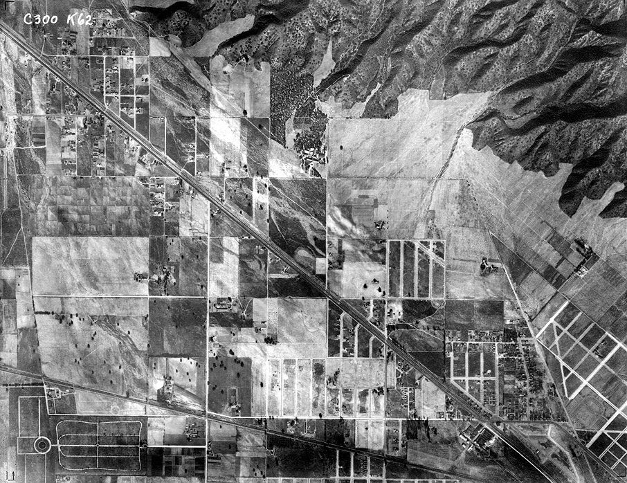
In 1980 the French intellectual Michel de Certeau wrote about what it was like to look down on the streets of Manhattan from the 110th floor of the World Trade Center. De Certeau died before those towers took on the meanings that they have had since 9/11, 2001. But his point wasn't about those towers in particular. He thought that the “pleasure” of looking down on the world from a great height was due to the way that it freed you from the pulsating and ultimately unknowable hubbub taking place at ground level. The view from above was the God-like perspective which rendered the world readable at the cost of our separation from it. Cartographers, city planners, bureaucrats, and administrators viewed the world in this way because it abstracted populations and landmasses so as to render them knowable, manageable, and malleable.
There is pleasure in aerial photography and it’s hard not to see this as connected to its power to abstract. Aerial photographs have a special kind of beauty because they both register the world and offer us a view of that world that most of the time is unavailable to us. We find it hard to connect the photographs to a world that we know: much easier to enjoy the patchwork, the shapes, the lines cut by rivers or roads. That this perspective has been associated with death, with killing is of course unavoidable. The Orson Wells character in The Third Man justifies his racketeering in dodgy pharmaceuticals with the view from the top of a Ferris-Wheel in Vienna.Look down there” he says “Would you really feel any pity if one of those dots stopped moving for ever? If I said you can have twenty thousand pounds for every dot that stops, would you really, old man, tell me to keep my money - or would you calculate how many dots you could afford to spare?”
In a book of aerial photography that was published in 1953 (Our World from the Air: An International Survey of Man and his Environment) a foreword claims that the twentieth century is the century of the air in the same way that the 19th century was the century of the railway. Because the echo of the Second World War was still reverberating loudly it at once recognises that mechanical flight had allowed humans to drop thousands and thousands of bombs on each other, but wanted to push the reader into thinking about how aerial photography could be used by “the geologist, the archaeologist, the town-planner, the sociologist”.
Today when so many more people have had the experience of mechanical flight, aerial photography still offers an uncanny vision of the world. The view of the world you get from your budget airline passenger seat is never really vertical (unless something has seriously gone wrong) and is always mediated by the slightly cloudy double-glazing of the tiny windows. Aerial photographs have a calmness that is never available in the cramped seating of economy class.
They seems to speak more readily of some of the experiences of the young flyers who became pilots during the Second World War:

The physically amazing thing about flying, after the speed impression of taking off and low flying, is that as you gain height the sense of motion drops away. It’s nothing like looking out of the railway carriage and seeing the blurry silver worms zipping past or the ritual nodding of telegraph lines. It is impressively stable and still up there and this is the important point, the world is laid out for you in unfamiliar terms… the visual field is flattened more after the plan view of the microscope section than the elevation that everyday seeing is accustomed to.

This is the artist Nigel Henderson remembering his experience of flying. It was an experience that went from enormous pleasure to nerve-wracking fear. However familiar it may become, and however it is used for instrumental ends, the view from above is also always vertiginous and discombobulating. A god-like view is the view of someone who has no place. The view from above is also the view of someone falling to earth.

Thursday, 4 September 2014

Apocalyptic Wallpaper


In North America in 1952 the critic Harold Rosenberg coined a phrase – ‘Action painters’. Action painters referred to those who today are more usually termed abstract expressionists: Jackson Pollock, Lee Krasner, Mark Rothko, and so on. Rosenberg wanted us to recognise these artists as performing an existential act in the studio. He had some words of warning too. He warned that abstract artists could end up producing nothing more than ‘apocalyptic wallpaper’ if they weren’t careful. The fear of wallpaper and domestic design is everywhere in American abstraction at this time. Mark Rothko, for instance, somewhat earlier, reckoned his paintings ‘must insult anyone who is spiritually attuned to interior decoration; pictures for the home; pictures for over the mantel’. Likewise the critic Clement Greenberg was constantly wringing his hands at the way that certain artists could descend into the decorative as if it were a bad case of the ‘dreaded lurgy’.
Across the Atlantic there didn’t seem to be such a fear of the decorative, nor of the domestic. For instance in 1955 the sculptor and collagist Eduardo Paolozzi with his friends Nigel and Judith Henderson set themselves up as a firm to produce wallpaper, textiles, furniture and so on. The firm was called Hammer Prints Ltd. Paolozzi was at the time having a huge success with his sculpture. I like to think that British artists like Paolozzi (and by British I mean Scottish-Italian-British) had read Harold Rosenberg’s essay on action painting, and instead of heeding the warning about apocalyptic wallpaper decided that that was precisely what they wanted to do. What, after all, would it be like to live in house papered with apocalyptic wallpaper?
One of my favourite set of paintings is by the wonderful artist Susan Hiller. I saw an exhibition of her work at the ICA in London in the late 1980s. One of the exhibits was a series of works of paint on the wallpaper used to paper children’s bedrooms: wallpaper featuring parachute jumpers floating through the sky, or action heroes, or cute aliens. These were the gendered wallpapers of a different sort of action: masters of the universe saving the world – not so much existential actors as testosterone-fuelled maniacs. The paint obliterated most of the figuration, but allowed snippets to poke through. The painting used scaled-up images of Hiller’s automatic writing. In some of the paintings it looked like the male action figures were drowning in an unconscious patterning of paint.
For a while I was an abstract painter. My dad used to say that my paintings would look really good in the corridors and boardrooms of a large corporation. I think he was imagining the money that might come my way if I could snag such a commission, but he was also keying into the way that the corridors of power for a while at least, loved the sort of tasteful abstraction that looked simultaneously expensive and inoffensive. I think he also couldn't imagine anyone in their right mind buying one my paintings for their home. 


Wednesday, 3 September 2014

Foreign Holidays


When I was about eleven my parents took my sister and I on a driving holiday on ‘the continent’ (as we called mainland Europe). Over two weeks we dashed from one picturesque town to another across France, Germany, Luxembourg, Switzerland and Italy staying in an uneven range of small hotels. We were ill-equipped for such travel in the early 1970s because no one apart from my sister could speak another language, and she was always too shy or too stubborn to lend a linguistic hand. On one occasion, in a small German town, my dad dropped us off at a restaurant, parked the car and came to find us. He had made a note of the name of the street and so after the meal we went to look for the car in Einbahnstrasse. We found what we thought was the street but there was no car there. It was only by luck that we chanced upon the car in another street, and eventually understood that Einbahnstrasse didn't name the street just its condition of one-way-ness.
It was a holiday that was organised by a travel agent; a sort of package-holiday for people who don’t know how to relax (or are a bit suspicious of such hedonism). So we would keep bumping into the same fraught British families as we raced from one destination to the next. It was an era before air-conditioned cars where the seats were nearly always plastic, and where parking a car in a non-shady spot would result in the interior taking on an almost molten state (car rugs were needed to protect bare flesh from being fused to the fiercely hot seats). It was a holiday punctuated with travel-sickness, sullen silences (we took turns and picked up the slack left my dad’s endless optimism), and new experiences. Continental food, even in tourist-ready hotels, could prove tricky and my sister, who had been warned-off eating anything at all by a barmy xenophobic school teacher, maintained a strict ascetic diet of bread and fizzy drinks. And the fizzy drinks were a highlight – who knew that fizzy drinks could taste of apple, or that fizzy orange didn't have to have a radioactive colour and a flavour that made pure sugar taste bitter?
These days the frisson of difference doesn't seem so extreme. I notice it most in the small details. The pylons and telegraph poles are different. The grass is thicker, coarser, more springy. The street signs are placed differently. There are less road markings. The advertising hoardings seem to articulate different causes for commodity-based happiness. 

Wednesday, 27 August 2014

Sensibility Primer


In 1983 the architect Alison Smithson published a book called AS in DS: An Eye on the Road. It was a project she had been very loosely working on since the late 1950s when she and Peter Smithson traded in their Volkswagen Beetle for a Citroën DS (the books title refers to Alison in the Citroën AS in DS). The book (which is still available) is shaped to look like a Citroën DS seen from above and is called a ‘sensibility primer’. The inspiration for the book came about when Alison experienced the interior space of the Citroën as completely different from their VW Beetle: ‘I remember thinking you were so close together in the Volks and so far apart in the DS your relationship as a married couple was bound to subtly change. Now you could stand off the situation of each other. Then it was love in a box.’ Design, it would seem, has effects and affects and could alter the way you related to others, the way you loved.
            AS in DS is a phenomenology of a vehicle. It has diagrams of the car’s design, maps of the journeys that the Smithsons took, photographs and sketches of the views that she saw when travelling through various landscapes and roadscapes, and a continual diary of car experience. It is about sensibility. It is about the way perceptions and feelings alter when you are placed in a specific set of relationships to those around you and to your environment. It represents an alternative to a sociology of design that would look to see what sort of aspirations could be associated with driving a DS, what such a car symbolised. It is also an alternative to the aesthetic and practical discussion of what constitutes ‘good design’. It deserves to be much better known as an initial sally in the phenomenology of design culture.
We've just given up on our beloved Fiat Multipla (it was falling apart) and bought a second hand Volkswagen Turan. The Multipla is unusual because it has three separate seats in the front and the back (the one we had also had the distinctive forehead bulge between the windshield and the bonnet). With three seats you could have the middle one down which immediately allowed for more communication between those in the front and those in the back, or you could sit three across in the front. I think I only realised how brilliant this was when we gave it up. A car with two seats in the front seems to insist on that fundamental arrangement of cars: the front reserved for Mum and Dad, or Dad and Dad, or Mum and Mum, and the back seat the ‘ghetto’ for the kids. These generational zones (serious up front, bickering in the back; getting lost and anxious in the front, getting bored and fractious in the back) have been the familial shape performed by millions and millions of cars. The Multipla wanted something different.


Thursday, 17 July 2014

Goggle Box


News just in: TV has eaten itself and it is still hungry. Actually this is old news. In the heady days when people spoke about postmodern this and postmodern that (the 1980s and 90s – such talk was probably killed off by the millennium bug) TV was always eating itself. Shows like Max Headroom on the newly convened MTV and films like Bill and Ted’s Excellent Adventure seemed to be as much about TV as about the world. The wonderful Royle Family from the late 1990s seemed to herald the final move; here we – the audience – were positioned as if we were the TV watching a family that was looking back at us. A sort of mirror poking through the back of the TV into another room with a family looking back at the screen and getting on with life. Not a window on the world, then, but a mirror reflecting back the domestic setting of TV.
But the Royle Family was not the endgame of such self-reflection, it was merely the last time that it seemed exceptional. Now we have Goggle Box where couples and families offer commentary on TV programmes. They too are positioned facing the screen and we view them from the TV. And in case anyone was failing to get all the references to the Royle Family, Goggle Box is narrated by Caroline Aherne who wrote and starred in the Royle Family. What is significant about Goggle Box is not the strange tautological fact that you are watching people watching TV on TV, but that this seems perfectly fine, as if this is exactly what TV is all about. And TV does seem to be about the watching, about the chat, about the comfy sofa as much as about the programme. Friends always understood this: the characters always seem to be watching any-old-thing – the enjoyment came from the furnishings, from each other.
Goggle Box though doesn’t present a hermetic TV world. It offers us the pleasures of connecting to other ‘just like us’ who are also watching TV, chatting, poking fun at some of the shows, discussing others, sleeping through the occasional one or two. When you watch Goggle Box there is no need to think ‘but I could do that’ – you are doing it, already. Ta da. Goggle Box is the materialisation of TV seen under conditions of social media. What is odd about it is that people just seem to be watching TV and talking; where are the mobile phones? Where are the tablets? Goggle Box has incorporated the pleasures of social media into its format and returned it to us as something like a sit-com with the emphasis on the sit.


Wednesday, 16 July 2014

Etch-A-Sketch


The Etch-A-Sketch toy came onto the market in the 1960s. I was trying to imagine what was going through André Cassagnes’ mind when he invented the device. The first thing that came to mind was that perhaps he felt that drawing, using pencil or some other mark-making equipment and paper, was just far too easy. What was needed was something to make it a lot tougher. Etch-A-Sketch is first of all an impediment to drawing. As a toy it is a drawing frustrater, an un-drawing machine. What makes those scenes so fabulous in Toy Story and Elf, where an Etch-A-Sketch is used to conjure finely-rendered images and maps is that in reality it takes ages just to write your wobbly initials.
My second thought was that this updated version of the ‘mystic writing pad’ plays on the glamour of the TV set. You have to cast your mind (or your browsing searches) back several decades to get to TVs where you had to tune them in to one of three channels using a dial. The dialling of knobs is the key. The endless twiddling as you run through the wavelengths is put to some sort of productive use in the Etch-A-Sketch. It is hard to see old TV sets as glamorous, but in the days of dial-tuned TVs, three channels and shut down at about midnight, a TV was an enchantment. We, as kids, tried to make our own by cutting holes in shoe boxes and sticking photos from magazines inside.
In the short history of electronic image technology it is perhaps fitting that a drawing device tried to look like a TV. Devices, electronic or not were always mimicking other devices – they still are. In the 1940s TV looks like giant cabinets, perhaps for holding drinks and glasses, for making cocktails. When microwaves came on the scene they took their look from the 1970s TV. Today it is not so much TV that is the form to mimic but the mobile phone, the laptop, and the iPad. The illuminated advert casings that you find at bus stops and along the street now look like giant iPads and iPhones. The Etch-A-Sketch anticipated the laptop and the tablet computer in the way that playing it felt like having a TV-like thing that could be used horizontally rather than vertically and was small enough to place on your lap. It is fitting then that one of the shells that you buy for your iPad is a shell that makes it look like an Etch-A-Sketch toy, and it seems right that someone would make a felt Etch-A-Sketch phone cover for their iPhone. 


Monday, 14 July 2014

Avocado Roulette

  
          For a while, in the 1970s, one way of recognising the signs of middle-class bohemianism was to spot sad looking wood-like balls, pierced with cocktail sticks, sitting over glasses of water, waiting to sprout or to rot, on windowsills. These were the seeds or stones of avocados. It was a practice driven by hope rather than experience. Perhaps some of these stones did sprout roots, and then perhaps a leaf formed, but as plants the avocado had little future in the inclement British weather. Someone somewhere said that 'knowledge, is knowing that a tomato is a fruit; wisdom is knowing not to include it in a fruit salad'. The fruit of the avocado tree is a berry (botanically speaking, or rather Wikipedially speaking) made up of a single seed. Someone somewhere played a mean trick on those new to avocados by calling the ‘fruit’ of the tree an ‘avocado pear’ and then laughing when you didn’t treat it as a salad vegetable. Apparently when the shop Marks and Spencer first sold avocados in the early 1970s people would buy them and eat them with custard and then complain that they didn’t taste very nice.
            Avocados in Britain are a hit-and-miss affair. As a regular purchaser of avocados I’d say that 30% of the ones I buy are inedible (either they’ve gone bad or are rock-hard); 60% are good-bad (they have bits of string in them, some black bits, but also some parts that look OK); 10% are perfect. That’s not good odds. But it means that when you’ve snagged a perfect one you feel as if you’ve hit the jackpot (avocadally speaking). We have a tea-towel with the legend ‘the Seven Stages of the Avocado’ written on it. Underneath the legend are seven identical pictures of avocados and underneath the pictures are the words: ‘not ripe, not ripe, not ripe, not ripe, not ripe, not ripe’, and then under the last avocado, simply ‘bad’. But buying an avocado is not just a gamble in trying to find an edible one, it is playing roulette with your taste. I love the 10% of perfect ones (I can’t think of any foods I love more), but the vast majority of avocados all have something that fills me with disgust, makes me shudder and nauseous and threatens to make me give up on them.
            But I stick with the imported avocado. My favourite avocado dish is very simple. For some reason in this house we call it ‘the taste of California’. It was passed on to us by old friends. It is made up of a simple dressing (white wine vinegar, Dijon mustard, good olive oil), some good oranges (skinned and sliced and pips removed), a couple of perfect avocados (peeled, de-stoned, and sliced) and a big clump of fresh coriander leaves (chopped). Just throw it all together, or arrange in a pattern. It is fresh tasting, and lovely. In the last months of my dad’s life the only thing he really enjoyed eating was avocados. Not ‘the taste of California’. Just cut in half, with some French dressing in hole where the stone was. Eaten with a tea spoon. Thanks avocados.